
How to Create a Dashboard That Banks Actually Use
Brian's Banking Blog
Most advice about how to create a dashboard starts in the wrong place. It tells you to choose a chart library, arrange attractive cards, connect a few data sources, and then ask executives to find the meaning. That approach produces a visual report, not a management instrument. A bank dashboard should begin with the decision someone must make this week, then show only the evidence, threshold, and ownership required to make that decision confidently.
For bank executives and directors, the standard is straightforward. A dashboard must help a relationship manager prioritize a call, help a CFO prepare for an ALCO discussion, or help a risk officer escalate a deteriorating position. If a tile doesn't change what someone does, it hasn't earned its place.
Why Most Bank Dashboards Fail Before They Launch
The popular assumption is that dashboards fail because the charts are unattractive or the software is difficult. The deeper problem appears earlier. Teams often select visuals before defining the executive question, collect every available KPI, and leave leadership to interpret a crowded screen without a clear path to action.
Research on dashboard design supports a different starting point. A systematic review found that dashboard projects were most often driven by intended purpose, at 33%, or user needs, at 32%, while only 30% of reviewed studies reported a usability assessment. Those findings point to a practical conclusion: a dashboard can be technically complete and still fail as a decision tool. The systematic review of dashboard design provides useful evidence for putting purpose and usability ahead of decoration.
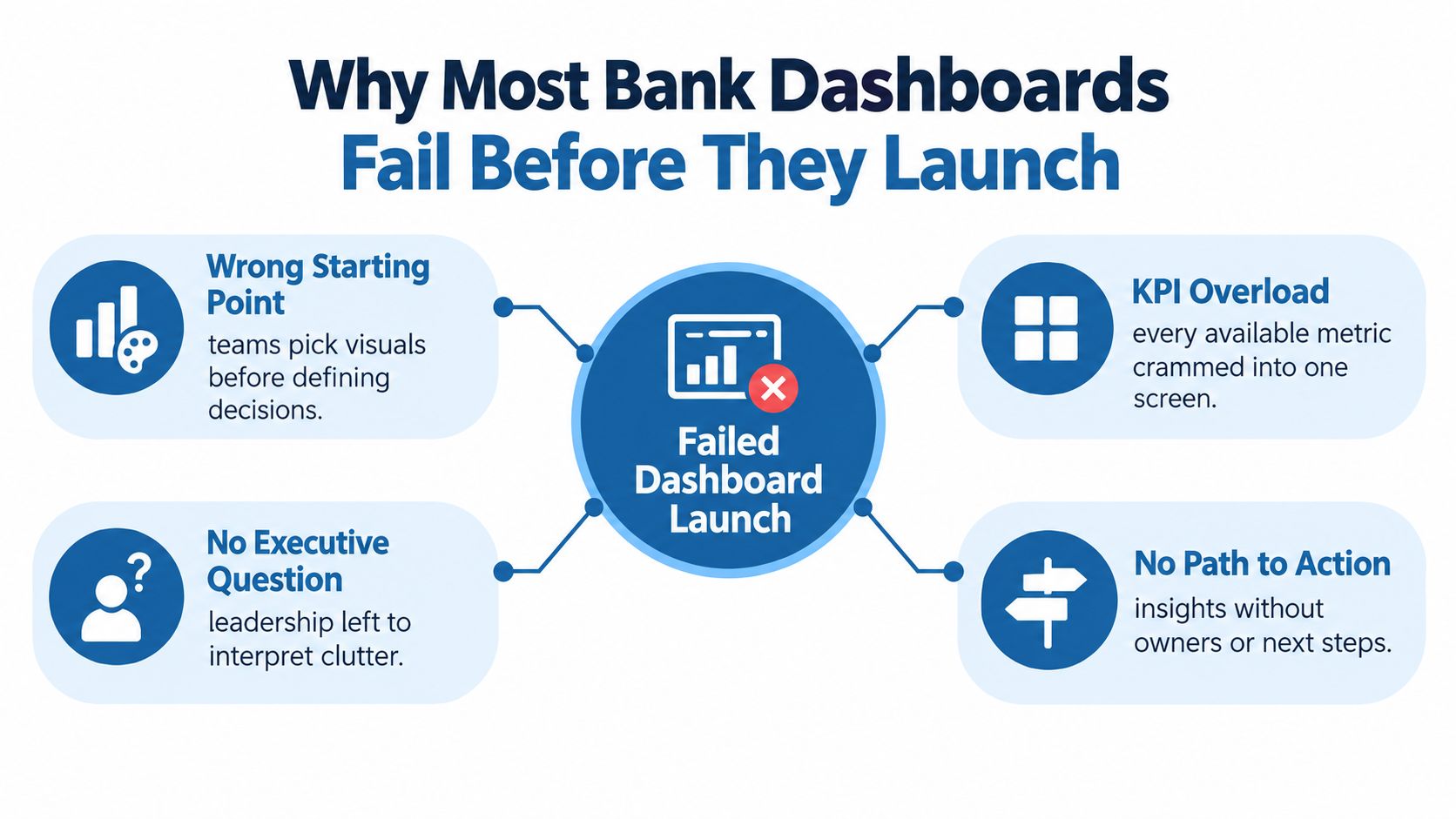
The four failures that matter
Unwritten objectives create screens that answer no defined question. “Show deposit performance” isn't an objective. “Identify commercial deposit relationships that are losing peer share and assign the next call” is one.
Unowned metrics create accountability gaps. A deposit-growth tile may show movement, but nobody knows whether treasury, commercial banking, finance, or the relationship manager must respond.
Disconnected thresholds turn alerts into decoration. A credit-risk indicator without a documented escalation path is theatre. The red color may attract attention, but it won't tell anyone what to investigate, who should act, or how quickly.
KPI overload makes executives work as data analysts. A director shouldn't have to compare a grid of disconnected ratios to discover that loan growth is outrunning capital or liquidity. The dashboard should make that relationship visible.
The Balanced Scorecard, introduced by Robert Kaplan and David Norton in 1992, organized performance across financial performance, customers, internal business processes, and learning and growth. Its durable lesson remains relevant to bank dashboards: indicators should connect to strategic objectives rather than merely reflect the data available. The history from static executive summaries to self-service visual analytics reinforces the same principle described in this overview of dashboard and KPI design.
Practical rule: If a tile doesn't identify a decision, threshold, and owner, remove it before launch.
A dashboard is a decision surface. Teams building a web-based interface can also review this practical resource on web-based dashboard development, but the technology should follow the decision model, never replace it.
Defining Decisions, KPIs, and Success Criteria
Start with four statements before drawing a chart. The sequence prevents a familiar failure in banking projects, where a role is named but the actual moment of decision remains vague.
Name the user and the moment
“The CFO” is too broad. Specify the CFO preparing for next Tuesday's ALCO meeting. “The relationship manager” is equally broad. Specify the relationship manager ranking mid-market prospects for this quarter's calling plan.
Then write the question in ordinary banking language. For example: Which commercial deposits are drifting below peer share, and why? Which prospective institutions have the strongest deposit potential, acceptable switching risk, and a relationship owner who can act?
The third statement locks the decision. The user may need to re-price, hold, escalate to a calling campaign, tighten a limit, or investigate a peer-relative gap. Don't ask the dashboard to support every possible decision on the first screen.
The fourth statement defines success. For a peer-outreach dashboard, success may mean producing a ranked action list with named owners and a review cadence. For deposit-share defense, the KPI might be non-interest-bearing funding share relative to a defined peer cohort, measured monthly, with a written threshold that triggers a treasury review.
Put the objective into a repeatable template
| Element | Peer Outreach Prioritization | Deposit-Share Defense |
|---|---|---|
| User and moment | Relationship manager preparing the quarterly calling list | CFO and treasury team preparing for the monthly funding review |
| Business question | Which mid-market prospects have the strongest deposit opportunity and switching risk? | Which commercial deposit relationships are falling below peer share, and what is driving the change? |
| Decision | Assign a prospect owner and next outreach action | Re-price, hold, or escalate to a calling campaign |
| Success criterion | A ranked list with a named owner and documented next step | A monthly peer-relative KPI with a written treasury-review trigger |
| Review cadence | Weekly during campaign planning | Monthly, with escalation when the threshold is crossed |
Each decision needs one accountable owner, one threshold, and one next step. A team inbox isn't an owner. “Monitor closely” isn't a next step. A threshold should produce an operational response, not merely change a color on a screen.
This discipline aligns with practical guidance on building effective KPI strategies, particularly the need to connect measurement with an explicit business purpose. A bank can document the same logic in a performance measurement system, provided the definitions, responsibilities, and review process remain visible to the people using the dashboard.
Use the decision to limit the first screen
An executive overview should answer one question quickly. It shouldn't display every measure needed by finance, credit, treasury, sales, and operations at the same time. Put diagnostic trends and drill-down evidence behind the overview, where the user can inspect the reason for a signal without losing the original decision context.
The test is simple. Ask the intended user to state what action the screen supports, what condition triggers it, and who owns the response. If the answer requires a spreadsheet, a meeting, or a second dashboard, the objective isn't finished.
Mapping the Data Sources That Actually Matter
A dashboard becomes trustworthy when every KPI has a documented source, refresh cadence, accountable steward, and fallback. Without that map, two screens can show different deposit figures while both appear authoritative. Executives then stop debating the decision and start debating which number is real.
Bank dashboards usually combine four data layers:
- Regulatory data: UBPR, Call Report FFIEC 041 and FFIEC 051 data, FDIC Summary of Deposits, and Call Report NIC series.
- Market and macroeconomic data: Rate curves, peer-bank pricing, and deposit-benchmark indices.
- Internal systems: The general ledger, core banking platform, loan origination system, and CRM.
- Derived intelligence: Peer screens, peer benchmarks, and competitive rate aggregators.
The first layer establishes a common language for performance and risk. The FFIEC describes the Uniform Bank Performance Report as an analytical tool for supervision, examination, and management, with uses spanning earnings, liquidity, capital, asset and liability management, and growth management. That makes UBPR more than a historical feed. It can anchor the management questions the dashboard is designed to answer.
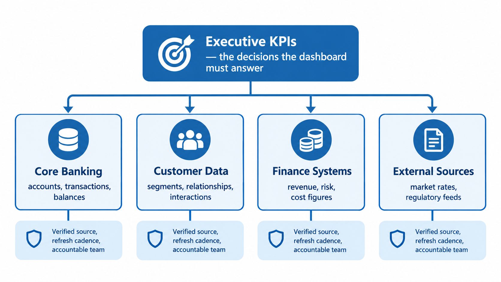
Give each metric a source contract
For every KPI, record:
- Primary source: The system used for the reported value.
- Fallback source: The system used when the primary feed is unavailable.
- Grain: Institution, account, relationship, product, or reporting period.
- Refresh cadence: How often the value can legitimately change.
- Lag tolerance: How old the data can be before the tile is marked stale.
- Data steward: The person who signs off on definition and reconciliation.
Peer comparisons deserve special care. FFIEC peer-group reports include peer definitions, trimmed peer averages, and ratio definitions. A dashboard should therefore show the selected cohort beside the institution's value, rather than display an unqualified average that could be distorted by an unusually large or weak institution. A $700 million community bank with a 3.20% net interest margin against a 3.45% peer average has a 25-basis-point gap, but the management implication depends on where that bank sits in the peer distribution. Those figures and the peer-group mechanics are documented in the FFIEC peer-group report.
The metric layer should reject unowned and unaudited measures. If no team can explain the source, period cutoff, or reconciliation rule, the KPI doesn't belong on an executive screen.
Preparing and Modeling Data for Trust
Raw feeds don't agree automatically. Institution codes can differ, reporting periods can use different cutoffs, and peer classifications can change over time. A bank that skips governed preparation eventually asks executives to act on numbers that cannot be reproduced.
Separate cleaning from modeling
Cleaning makes inputs comparable. It includes deduplication, institution-code mapping, period validation, null handling, impossible-ratio checks, and reconciliation against an authoritative source.
Modeling makes the cleaned inputs reusable. It includes joins, aggregations, KPI calculations, and dimensional structures that let users move from an executive view to an institution, geography, product, peer group, or reporting period.
| Stage | Share of Effort | Example Banking Tasks |
|---|---|---|
| Cleaning | Depends on source condition and governance maturity | Map institution identifiers, remove duplicate institution-period records, validate reporting cutoffs, reconcile deposit totals |
| Modeling | Depends on decision complexity and reuse requirements | Join institution and peer dimensions, calculate peer-relative measures, aggregate product trends, support drill-down views |
The effort split shouldn't be guessed before the team profiles the feeds. A clean regulatory extract may need limited preparation, while a CRM export can require extensive mapping before the bank can connect a prospect to an institution, product, owner, and activity history.
Build a controlled metric vocabulary
Create reusable dimensions for institution, peer group, product, geography, and period. Version those dimensions so a reclassification doesn't silently rewrite historical analysis. If a bank moves between peer cohorts, the dashboard should preserve the prior classification and show when the current definition took effect.
Treat the metric layer like a controlled vocabulary. A net interest margin must have one definition, one source line item, one as-of date, and one owner. Every tile should reuse that governed measure instead of recreating KPI math inside a visualization.
A data dictionary should name the owner of each field, acceptable tolerance bands, refresh expectations, and the evidence required for reconciliation. New tiles should pass a data-contract review before they reach production. Teams building reusable ingestion and transformation logic can document that process through a data pipeline construction approach, but the principle is platform-independent.
Trust isn't a visual property. It is the result of definitions, lineage, validation, and repeatable calculations.
The CFO should be able to open the source evidence without rebuilding the number in a spreadsheet. That standard separates a management dashboard from a polished collection of guesses.
Designing Visuals That Drive Action
Visual design in banking is a hierarchy problem. The executive screen should answer the decision question quickly, while the analyst layer should preserve the detail required to validate and explain the signal. Put the summary first, then expose evidence progressively.
A strong first screen typically contains one outcome scorecard, one variance view against a clearly labeled peer band, and a limited set of diagnostic indicators. Raw rows, distributions, sparklines, and supporting methodology belong behind a drill-down, not beside the primary decision.

Replace clutter with hierarchy
A cluttered executive view might show a grid of deposit, loan, margin, capital, staffing, pipeline, and service metrics with equal visual weight. The executive must decide which values matter and mentally assemble their relationships.
The cleaner version puts the decision at the top:
- Outcome: Current deposit-share position against the selected peer cohort.
- Movement: Monthly change and direction.
- Reason: Product, relationship, geography, or pricing driver.
- Action: Owner, threshold, and next review date.
A rainbow line graph creates a similar problem. Use one stable meaning per color, direct labels, accessible contrast, and consistent number formats. Label the peer set inside the view, so users don't have to remember which institutions or asset range the comparison includes.
Freshness belongs on every tile. Display the as-of timestamp, source status, and whether a figure is reported, estimated, or modeled. A stale value must look stale. Otherwise, an executive may mistake delayed information for current performance.
Make interaction explain the change
Filters should be limited, sticky where they support the workflow, and reset predictably when a dashboard is published or shared. Tooltips should answer why the number changed, not merely repeat the number already on screen.
For example, selecting a peer group should reveal the cohort definition and its effect on the comparison. Selecting a portfolio should show whether the change reflects volume, pricing, mix, or reporting period. Relationship managers who need to convert a signal into assigned work can borrow useful interaction ideas from this task management dashboard guide, while keeping the banking metric definitions under internal governance.
Before and after testing should focus on task performance. Can the CFO identify the largest peer-relative gap? Can the relationship manager locate the supporting institution record? Can the risk officer find the underlying period and source? Guidance on data visualization best practices is useful only when it serves those concrete questions.
A dashboard earns screen space when every tile points to an action, an owner, and a confidence or coverage indicator. Anything else belongs in the supporting layer or in the backlog.
Wiring Alerts, Workflows, and Owner Accountability
A dashboard without a workflow is a museum piece. It preserves what happened, but it doesn't ensure that anyone responds when a metric crosses a management boundary.
Wire every important KPI to four fields: numeric rule, named owner, delivery channel, and remediation window. Regulatory floors, peer-relative gaps, and operational signals may use different thresholds, but none should fire without a documented route.
Use three alert layers
Regulatory floors can cover measures such as CET1, LCR, and the NPL ratio. The owner needs to know whether the alert calls for immediate escalation, a review of assumptions, or a documented exception.
Peer-relative gaps can cover deposit share, fee income ratio, and cost of funds. The alert should identify the peer cohort and explain whether the gap reflects a level, a recent movement, or a longer trend.
Operational signals can cover pipeline slippage, covenant waivers, and large-spread tickets. These alerts usually need a direct handoff to a relationship manager, credit officer, or treasury analyst.
The rule must be precise enough to reproduce. “Margin is weak” is not a rule. “Margin trails the selected peer boundary by the defined tolerance for the required observation period” is a rule, provided the dashboard records the cohort, calculation, and period.
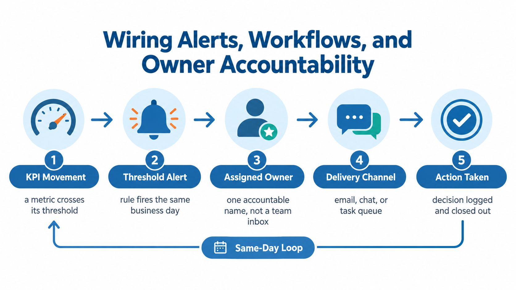
Turn a red tile into a scheduled response
Consider this hypothetical scenario. A bank sets an alert when net interest margin trails the peer-group 75th percentile by more than 45 basis points for two consecutive quarters. The CFO receives the alert on Tuesday morning, treasury receives a diagnostic worksheet on Wednesday, and relationship managers review deposit pricing on Thursday.
The value isn't the red tile. The value is the sequence. The CFO sees the peer definition and evidence, treasury investigates funding costs and asset yields, and relationship managers review the customer actions that could improve the position. If the review produces no action, the system should record the reason rather than close the alert without explanation.
FDIC reporting illustrates why the underlying mechanics need to remain visible. In the third quarter of 2025, industry net interest margin rose 9 basis points to 3.34%, while yield on earning assets rose 11 basis points and cost of funds rose 2 basis points. Total industry loans increased $159.0 billion, or 1.2%, during the quarter, and annual loan growth reached 4.7%, as documented in the FDIC third-quarter 2025 banking profile.
Those are different mechanics. A level, a quarterly change, and an annual growth rate shouldn't be collapsed into one card. An effective alert explains which one crossed the rule and which driver deserves investigation.
Every alert should retain audit metadata, including the rule version, data timestamp, recipient, delivery status, and closure note. Accountability closes the gap between a metric changing color and a management decision being made.
Securing, Auditing, and Iterating the Dashboard
Security and auditability aren't IT afterthoughts. They determine whether a bank can defend a dashboard tile before examiners, internal reviewers, and joint auditors.
Start with role-based views. A relationship manager may need assigned institutions, prospect activity, and calling priorities. A branch manager may need branch and market comparisons. The CFO needs institution-wide performance and peer context. An examiner view may need source lineage, definitions, and historical versions without exposing unrelated customer detail.
Make every displayed value defensible
Row-level permissions should follow job function and institution scope. A user shouldn't gain access to sensitive relationships merely because a filter exposes them. Apply authorization before aggregation where the data model requires it, and test both ordinary and exceptional access paths.
Document lineage from the source record to the on-screen metric. For a UBPR or Call Report measure, retain the source identifier, line-item definition, reporting period, transformation logic, and as-of date. For an internal CRM measure, record the field mapping, update owner, and treatment of missing or conflicting records.
Versioning must apply to filters, peer definitions, threshold rules, and metric formulas. If a director sees a changed result after a peer reclassification, the dashboard should show what changed and why. Silent rewrites destroy confidence faster than visible limitations.
Measure use, not vanity
Usage instrumentation should reveal which tiles support action and which are ignored. Track task completion, drill-down paths, export behavior, failed searches, and alert follow-up. A tile that is repeatedly scrolled past may need a different placement, better context, or retirement.
Usability testing should use representative tasks, not general opinions. A 2018 peer-reviewed study developed a checklist with 10 usability principles, including seven general principles and three information-visualization principles, supported by 49 usability factors. The checklist was tested by three nursing-informatics experts through task-based review of a vital-sign dashboard. The study's practical definition is directly relevant to banking: users should understand the displayed data and explore or interact with it effectively. The peer-reviewed dashboard usability study also describes the broader measurement gap in public-health dashboards, where only 30% of reviewed articles, or 26 studies, reported a usability assessment.
Test whether a director can identify a peer outlier, validate a trend, locate a decision-maker, and export evidence for a customer conversation. Repeat the tests after revisions. Refresh threshold logic on a defined governance cycle, and retire visualizations that no longer support a decision.
FDIC's fourth-quarter 2025 profile shows why ongoing monitoring must preserve size, portfolio, and time horizon. Industry net interest margin reached 3.39%, after a 5-basis-point quarterly increase. Total industry loans rose $267.8 billion, or 2.0%, during the quarter, while annual loan growth reached 5.9%, the fastest annual rate in 11 quarters. Community-bank loan balances increased 1.4% from the prior quarter and 5.4% from a year earlier, led by nonfarm nonresidential commercial real estate and commercial-and-industrial portfolios, according to the FDIC fourth-quarter 2025 banking profile.
A single loan-growth card could hide that concentration. The governed dashboard should separate portfolio categories, compare them with peers, and connect the divergence to limits, pricing, or stress-testing decisions. Benchmark your bank's KPIs and alert triggers against a defined peer cohort so leadership can determine whether the dashboard reflects competitive reality or merely internal comfort.
Visbanking provides bank intelligence and action workflows that unify financial, regulatory, market, and people data into explainable analytics, with dashboards, peer benchmarking, alerts, and exportable reports. Visit Visbanking to benchmark your institution, review peer-relative performance, and connect dashboard signals to the owners and actions that matter.
Latest Articles

Brian's Banking Blog
What Is Consultative Selling Approach and Why Banks Need It
Brian's Banking Blog
FDIC Call Report Software: What Bank Executives Need to Know
Brian's Banking Blog
What Is Peer Analysis in Banking? a Strategic Guide

Brian's Banking Blog
ML Pipeline Example for Bank Intelligence
Brian's Banking Blog
Proactive Outreach for Banking Sales: A Playbook
Brian's Banking Blog