Financial Dashboard Examples: Modern Bank Data Insights
Brian's Banking Blog
Unlocking the Power of Financial Dashboards for Banks
This listicle provides eight financial dashboard examples to help banking professionals make data-driven decisions. You'll discover how dashboards transform key financial data into actionable insights for improved performance, risk management, and strategic planning. Explore practical applications ranging from executive KPI tracking and real-time cash flow monitoring to compliance oversight and SaaS metrics analysis. These financial dashboard examples illustrate how banks can leverage data visualization for a competitive edge. Examples include executive KPI, CFO performance, SaaS metrics, real-time cash flow, investment portfolio, FP&A, startup metrics, and compliance dashboards.
1. Executive Financial KPI Dashboard
The Executive Financial KPI Dashboard serves as the central hub for monitoring an organization's financial health, providing a high-level overview tailored specifically for C-suite executives and board members. It consolidates the most critical financial metrics into a single, easily digestible view, enabling rapid assessment and strategic decision-making. Instead of delving into operational minutiae, this type of financial dashboard examples focuses on strategic Key Performance Indicators (KPIs) that offer a comprehensive snapshot of financial performance. This allows leadership to quickly grasp the big picture and identify areas needing attention.

A typical Executive Financial KPI Dashboard includes features like a revenue overview with year-over-year comparisons, profit margin and trend analysis, cash flow visualization, budget vs. actual expenditure tracking, key financial ratios (such as debt-to-equity), and market performance indicators. This consolidated view empowers executives to quickly gauge performance against targets and identify emerging trends. Learn more about Executive Financial KPI Dashboard to understand the transformative impact of data visualization in finance. This dashboard type is invaluable for high-level strategic planning and resource allocation.
Examples of successful implementations include Microsoft's Power BI executive dashboard used at Adobe, Tableau executive dashboards at Coca-Cola, and IBM Cognos implementations at Bank of America. These examples showcase the adaptability of executive dashboards across diverse industries. The ability to customize these dashboards to specific executive preferences and integrate forecasting elements further enhances their strategic value.
Pros:
- Quick Overview: Provides a concise snapshot of the company's financial health.
- Strategic Decision-Making: Facilitates informed, data-driven decisions at the highest level.
- Reduces Information Overload: Filters out operational details, presenting only the most critical information to executives.
- Forecasting Capabilities: Often includes predictive analytics to support proactive planning.
- Customization: Adaptable to individual executive preferences and information needs.
Cons:
- Oversimplification: May not capture the nuances of complex financial situations.
- Lack of Operational Detail: Unsuitable for department managers requiring granular data.
- Implementation Cost: Can be expensive to deploy and maintain, especially with enterprise-grade Business Intelligence (BI) tools.
- Data Governance: Relies heavily on accurate and reliable data for effective insights.
Tips for Effective Implementation:
- Focus on Key Metrics: Limit the dashboard to 5-7 KPIs to avoid overwhelming executives.
- Trend Indicators: Incorporate clear visualizations of trends and historical comparisons.
- Mobile Responsiveness: Ensure accessibility on various devices for on-the-go monitoring.
- Drill-Down Capabilities: Allow users to investigate anomalies and access underlying data.
- Consistent Color Schemes: Use a standardized color scheme (e.g., red/yellow/green) to represent performance levels intuitively.
The Executive Financial KPI Dashboard is an essential tool for banking executives, financial analysts, risk and compliance professionals, IT leaders, and regulators. Its focus on strategic KPIs, coupled with its concise presentation, makes it invaluable for high-level decision-making, performance monitoring, and ultimately, driving organizational success. The insights gleaned from this dashboard type inform crucial strategic discussions and ensure alignment between financial performance and overall business objectives. This approach, popularized by dashboard design experts like Stephen Few and integrated into platforms like the Salesforce analytics suite, aligns with the executive reporting frameworks championed by firms like McKinsey & Company.
2. CFO Financial Performance Dashboard
A CFO Financial Performance Dashboard is a mission-critical tool providing a comprehensive, real-time view of a company's financial health. It's tailored specifically for Chief Financial Officers and other key decision-makers, combining strategic financial metrics with operational insights to support both daily financial management and long-term strategic planning. This type of dashboard goes beyond basic reporting, offering in-depth analysis and visualizations to facilitate data-driven decisions. It serves as a central hub for monitoring performance, identifying trends, and proactively managing financial risks. This makes it a crucial element among financial dashboard examples, particularly for larger organizations.

This dashboard typically incorporates key financial data points from various sources, including the general ledger, accounts payable and receivable, and treasury systems. It presents this information in a clear and concise manner, using interactive charts, graphs, and tables. Features often include detailed income statement visualizations, balance sheet metrics with trend analysis, cash flow management tools (like cash conversion cycle monitoring), working capital analysis, foreign exchange exposure tracking, financial risk indicators, and compliance status updates. This breadth of information allows CFOs to quickly assess the company's financial position, identify potential problems, and take corrective action. Learn more about CFO Financial Performance Dashboard to understand the deeper impact of data-driven decision-making in the financial sector.
Examples of successful implementations include Oracle NetSuite's CFO dashboard utilized at Zoom, SAP's Financial Analytics dashboard at Siemens, and Workday Financial Management dashboards employed by Amazon. These examples demonstrate how large corporations leverage CFO dashboards to gain a holistic view of their finances and drive better business outcomes.
Pros:
- Combines strategic and operational metrics: Provides a complete picture of financial performance, bridging the gap between high-level strategy and day-to-day operations.
- Supports daily decision-making: Offers real-time data and analysis to inform critical financial decisions.
- Enables early risk identification: Highlights potential financial risks and vulnerabilities through dedicated indicators and trend analysis.
- Deep drill-down capabilities: Allows users to delve deeper into specific data points for detailed investigation.
- ERP integration: Often integrates seamlessly with Enterprise Resource Planning (ERP) systems for real-time data updates.
Cons:
- Complexity and data overload: Can be overwhelming due to the sheer volume and complexity of data presented.
- Customization requirements: Requires significant customization to align with specific company processes and reporting needs.
- Maintenance challenges: Keeping the dashboard up-to-date with changing reporting requirements can be demanding.
- Specialized knowledge: Interpreting the data effectively may require specialized financial expertise.
Tips for Implementing a CFO Financial Performance Dashboard:
- Logical grouping: Group metrics logically by financial domain (operations, investments, financing) for improved clarity.
- Scenario planning: Include scenario planning capabilities for forecasting and strategic decision-making.
- Alert systems: Implement alert systems to notify stakeholders of key threshold breaches or critical changes in financial metrics.
- Integration with reporting systems: Ensure seamless integration with tax and audit reporting systems for compliance and efficiency.
- Multiple timeframes: Create different dashboard views for varying timeframes (daily, monthly, quarterly, annual) to cater to different reporting needs.
The development and popularization of CFO Financial Performance Dashboards have been influenced by prominent organizations like PwC (with their financial reporting frameworks), Deloitte (through their CFO Program), and Financial Executives International (FEI). This dashboard's focus on comprehensive financial management and strategic decision-making makes it an indispensable tool for CFOs and other financial leaders in today's complex business environment. This makes it a worthwhile inclusion in any discussion of financial dashboard examples, particularly for banking executives, financial analysts, risk and compliance professionals, IT leaders, and banking regulators looking for comprehensive financial oversight.
3. SaaS Financial Metrics Dashboard
A SaaS Financial Metrics Dashboard is a specialized reporting tool designed to track the key performance indicators (KPIs) that drive growth and profitability for software-as-a-service (SaaS) businesses. Unlike generic financial dashboards, it focuses on subscription-based revenue metrics and provides insights into customer behavior, acquisition costs, and long-term value. This makes it an indispensable tool for data-driven decision-making in the SaaS world. It allows companies to monitor their performance, identify areas for improvement, and ultimately optimize their business strategy for sustainable growth. This type of financial dashboard is particularly valuable for understanding the nuances of recurring revenue models, customer churn, and the lifetime value of subscribers.

How it Works:
A SaaS Financial Metrics Dashboard aggregates data from various sources, including billing systems, CRM platforms, and marketing analytics tools. It then presents this data in a visually digestible format, typically using charts, graphs, and tables. Key metrics are often displayed in real-time, allowing for immediate insights and proactive adjustments.
Key Features:
- Monthly Recurring Revenue (MRR) Tracking and Forecasting: Provides insights into the predictable revenue stream generated from subscriptions. Forecasting capabilities help anticipate future revenue based on current trends.
- Customer Acquisition Cost (CAC) Analysis: Calculates the cost of acquiring new customers, enabling evaluation of marketing campaign effectiveness and overall sales efficiency.
- Customer Lifetime Value (LTV) Calculations: Estimates the total revenue expected from a customer throughout their relationship with the company. This metric is critical for understanding long-term profitability.
- Churn Rate Visualization with Cohort Analysis: Tracks the rate at which customers cancel their subscriptions. Cohort analysis segments customers based on their subscription start date to identify trends in churn behavior.
- Average Revenue Per User (ARPU) Metrics: Measures the average revenue generated per user, providing insights into pricing strategy effectiveness and customer segmentation opportunities.
- Cash Burn Rate and Runway Projections: Calculates the rate at which a company is spending its cash reserves and projects how long the current funding will last. Crucial for managing finances and securing future investments.
- Growth Efficiency Indicators: Combines various metrics to assess the efficiency of growth initiatives. This helps determine whether growth is sustainable and profitable.
Examples of Successful Implementation:
- ChartMogul dashboards implemented at Buffer
- Baremetrics analytics at Shopify
- ProfitWell reporting solutions at HubSpot
Pros:
- Specifically designed for subscription business models
- Balances growth metrics with profitability indicators
- Enables data-driven decisions about marketing spend
- Helps optimize pricing strategies
- Supports investor relations with industry-standard metrics
Cons:
- Less useful for non-subscription businesses
- Can overemphasize growth at the expense of profitability
- Often requires integration with multiple data sources
- May require frequent adjustments as the business model evolves
Actionable Tips for Readers:
- Include cohort analysis to understand customer behavior over time.
- Monitor Net MRR Retention as a key health indicator.
- Track expansion revenue separately from new business.
- Compare CAC by marketing channel for ROI analysis.
- Include cash flow projections based on the current burn rate.
When and Why to Use This Approach:
A SaaS Financial Metrics Dashboard is essential for any company operating on a subscription-based model. It is particularly crucial for:
- Monitoring Performance: Tracking key SaaS metrics like MRR, churn, and LTV provides a clear picture of the business's health and identifies areas needing attention.
- Driving Growth: Analyzing CAC and LTV helps optimize marketing spend and improve customer acquisition strategies.
- Managing Finances: Cash burn rate and runway projections enable proactive financial management and informed investment decisions.
- Supporting Investor Relations: Providing investors with clear and concise SaaS metrics demonstrates the business's financial health and growth potential.
This dashboard deserves its place on this list due to its specialized focus on the unique financial challenges and opportunities presented by the SaaS business model. For banking executives, financial analysts, and other professionals working with or investing in SaaS companies, understanding these metrics is critical for making informed decisions. The insights derived from a well-designed SaaS dashboard can significantly impact a company's trajectory, making it an invaluable tool for achieving sustainable and profitable growth. It provides the necessary granularity to understand the dynamics of recurring revenue, customer acquisition, and long-term value, enabling more accurate forecasting and strategic planning.
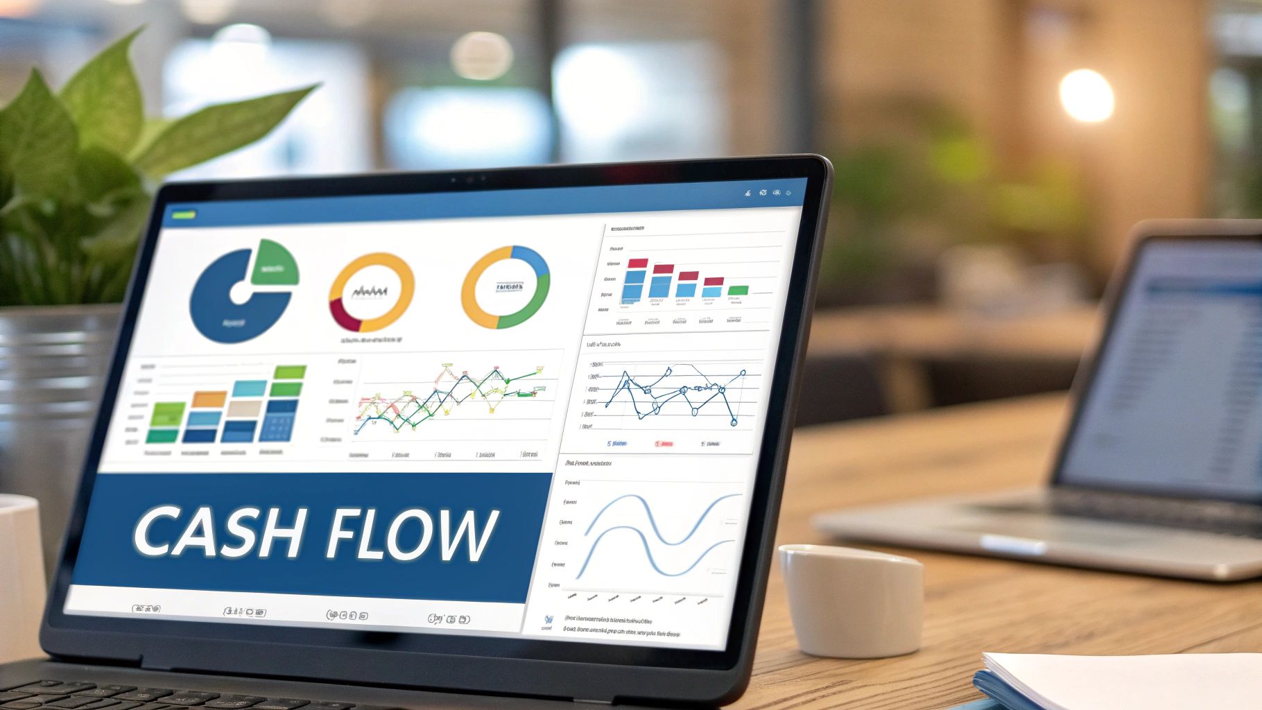
4. Real-time Cash Flow Dashboard
A Real-time Cash Flow Dashboard is a specialized financial dashboard example that provides a dynamic, up-to-the-minute view of a company's cash inflows and outflows. Unlike static reports that offer a snapshot of the past, this dashboard focuses on monitoring and forecasting cash flow in real-time or near-real-time. This allows businesses to maintain healthy liquidity, manage working capital efficiently, and anticipate potential cash shortfalls before they escalate into critical issues. This type of dashboard is crucial for making informed, data-driven decisions related to short-term financing, investment opportunities, and overall financial stability.
This dashboard deserves a place in any list of essential financial dashboard examples because of its direct impact on a company's financial health. Features such as daily cash position updates across all accounts provide immediate visibility into available funds. Accounts receivable aging with expected payment dates allows for proactive management of outstanding invoices and more accurate forecasting. Accounts payable scheduling and optimization helps businesses time vendor payments strategically to maximize working capital. Cash flow forecasting for 30/60/90 day periods, combined with working capital efficiency metrics and bank covenant compliance tracking, provides a comprehensive view of short-term liquidity. Visualizing the cash conversion cycle further enhances understanding of how efficiently the company generates cash from its operations.
Examples of Successful Implementation:
- Float cash flow forecasting at Mailchimp: This allows for precise management of cash balances during periods of high transaction volume.
- Fluidly AI cash management at TransferWise (now Wise): Leveraging AI-powered forecasting enhances the accuracy and efficiency of cash flow projections.
- Tesorio cash flow management at Veeva Systems: Automates and streamlines cash flow forecasting and collections processes.
Pros:
- Prevents cash flow surprises and potential liquidity crises
- Supports optimal timing of vendor payments
- Helps identify seasonal patterns in cash flow
- Enables more efficient use of credit facilities
- Critical for businesses with tight operating margins
Cons:
- Requires high-frequency data updates from multiple systems
- Forecasting accuracy depends on the quality of underlying data
- Can be complex to implement across multiple banking relationships
- May require significant manual input for non-standard cash events
Actionable Tips for Implementation:
- Integrate directly with banking APIs for real-time cash balances: This eliminates manual data entry and ensures accuracy.
- Incorporate probability weightings for large pending receivables: This adds a layer of sophistication to forecasting, acknowledging the uncertainty associated with large payments.
- Include scenario modeling for major business events: Prepare for potential impacts of significant events (e.g., new product launches, acquisitions) on cash flow.
- Set up automated alerts for potential cash shortfalls: Proactive alerts provide early warning signs, allowing for timely intervention.
- Regularly reconcile forecasts with actuals to improve accuracy: Continuous monitoring and adjustment ensures the model remains reliable.
When and Why to Use a Real-Time Cash Flow Dashboard:
This approach is particularly beneficial for businesses operating in dynamic environments, experiencing rapid growth, or managing complex financial operations. Companies with tight operating margins or those heavily reliant on short-term financing will find this dashboard invaluable. For Banking Executives, Financial Analysts, Risk and Compliance Professionals, Innovation and IT Leaders, and even Banking Regulators, having access to real-time cash flow data offers enhanced visibility and control, enabling proactive risk management and more informed decision-making.
Popularized By:
The development and adoption of real-time cash flow dashboards have been significantly influenced by leading financial institutions and consulting firms, including JP Morgan Treasury Services, Goldman Sachs Transaction Banking, and The Hackett Group's cash flow optimization frameworks. These organizations have championed the importance of real-time visibility and control over cash flow as a critical component of effective financial management.
5. Investment Portfolio Dashboard
An Investment Portfolio Dashboard is a sophisticated financial dashboard example crucial for effective wealth management. It provides a comprehensive overview of investment performance, asset allocation, risk exposure, and returns, making it a powerful tool for wealth managers, investment advisors, and individual investors alike. This type of financial dashboard combines historical data with forward-looking analytics to facilitate informed investment decisions. This deserves a place on this list due to its critical role in managing and optimizing investment strategies, a core concern for our target audience.
How It Works:
An Investment Portfolio Dashboard aggregates data from various investment sources, presenting it in a visually digestible format. It tracks the performance of different asset classes (stocks, bonds, real estate, etc.) and sectors, benchmarks performance against relevant market indices (like the S&P 500), and calculates key risk metrics. It also provides insights into dividend income, tax implications, and geographic/sector exposure. Sophisticated dashboards may even incorporate scenario analysis to model portfolio performance under different market conditions.
Features and Benefits:
- Asset allocation visualization: See the distribution of your investments across different asset classes and sectors using charts and graphs.
- Performance benchmarking: Compare your portfolio's performance against relevant indices to gauge its effectiveness.
- Risk analytics: Calculate metrics like Sharpe ratio, volatility, and maximum drawdown to understand and manage risk.
- Dividend and income tracking: Monitor dividend payments and other income generated by your investments.
- Tax efficiency analysis: Evaluate the tax implications of your investment strategy.
- Geographic and sector exposure mapping: Visualize your portfolio's exposure to different regions and industries.
- Historical performance with various time period options: Analyze past performance over different timeframes to identify trends.
Pros:
- Provides a comprehensive view of investment performance.
- Helps identify portfolio diversification issues and opportunities for optimization.
- Enables risk-adjusted performance analysis.
- Supports tax-aware investment decisions.
- Often includes scenario analysis for potential market events.
Cons:
- Can be data-intensive to maintain, especially with multiple investment sources.
- Historical performance may not be indicative of future returns.
- Often requires specialized financial data subscriptions, which can be costly.
- Risk models may underperform or be inaccurate in extreme market conditions.
Examples of Successful Implementation:
- Bloomberg Terminal portfolio analytics: Used by institutions like Morgan Stanley, offering real-time data, analytics, and trading capabilities.
- BlackRock's Aladdin portfolio management system: A comprehensive platform for institutional investors, providing risk management, portfolio construction, and trading tools.
- Personal Capital dashboards: Offers individual investors a user-friendly interface for tracking net worth, investment performance, and budgeting.
Actionable Tips:
- Include both absolute and risk-adjusted return metrics (e.g., Sharpe Ratio, Sortino Ratio) for a complete performance picture.
- Add correlation analysis between portfolio components to identify potential diversification weaknesses.
- Track performance attribution to understand which investments are driving returns.
- Include rebalancing alerts when asset allocation drifts from target percentages.
- Consider adding ESG (Environmental, Social, Governance) metrics for sustainable investing insights.
When and Why to Use This Approach:
An Investment Portfolio Dashboard is invaluable for anyone managing a significant investment portfolio, whether you are a wealth manager overseeing client assets, a financial analyst evaluating investment strategies, or an individual investor seeking to optimize their personal portfolio. It provides the necessary tools and insights to make data-driven investment decisions, manage risk effectively, and strive for long-term financial goals. This approach is particularly beneficial in complex market environments where understanding and managing risk is paramount.
Popularized By:
- Morningstar investment analytics: Known for their independent investment research and fund ratings.
- Vanguard's portfolio analysis tools: Provides investors with tools to analyze their portfolio's asset allocation, performance, and costs.
- Ray Dalio's risk parity approach at Bridgewater Associates: Emphasizes balancing risk across different asset classes rather than simply allocating capital based on expected returns.
6. Financial Planning & Analysis (FP&A) Dashboard
A Financial Planning & Analysis (FP&A) Dashboard stands as a crucial tool within the broader landscape of financial dashboard examples. It serves as a central hub for financial professionals to monitor, analyze, and plan an organization's financial health. This comprehensive dashboard empowers FP&A teams to support budgeting, forecasting, and deep-dive financial analysis, ultimately driving strategic decision-making. It achieves this by connecting real-time financial results with budgeted figures, allowing for continuous performance tracking, variance identification, and proactive adjustments to the planning cycle. This makes it an indispensable resource for businesses of all sizes seeking to optimize financial performance.
How it Works:
The FP&A dashboard aggregates data from various sources, including accounting systems, ERP software, and other relevant databases. This data is then processed and visualized through interactive charts, graphs, and tables. The dashboard facilitates comparisons between actual performance and budget expectations, enabling quick identification of variances and triggering investigation into their underlying causes. Furthermore, it incorporates rolling forecasts, scenario modeling, and driver-based analysis to provide a dynamic and forward-looking perspective on financial performance.
Features and Benefits:
A robust FP&A dashboard typically includes the following features:
- Budget vs. Actual Analysis with Variance Explanations: Provides clear visibility into deviations from the budget, allowing for prompt corrective action. Commentary fields can be incorporated to document the reasons behind variances.
- Rolling Forecasts with Scenario Modeling: Enables businesses to anticipate future performance under various economic conditions and adjust plans accordingly.
- Departmental Performance Tracking: Breaks down financial performance by department or business unit, promoting accountability and identifying areas for improvement.
- Cost Center Analysis and Allocation: Facilitates detailed analysis of costs and their allocation to different departments or projects.
- Headcount and Personnel Expense Tracking: Monitors personnel-related costs, including salaries, benefits, and other related expenses.
- Capital Expenditure Monitoring: Tracks capital investments and their impact on the overall budget.
- Key Driver Analysis for Financial Performance: Identifies the most significant factors influencing financial results, allowing for focused efforts on improving key drivers.
Pros:
- Streamlines the planning and budgeting process
- Provides early warning for budget overruns
- Supports data-driven resource allocation decisions
- Enables more accurate financial forecasting
- Helps identify cost-saving opportunities
Cons:
- Often requires significant customization to the business model
- Can be time-consuming to maintain with frequent forecast updates
- May create information silos without proper integration
- Quality depends heavily on underlying data governance
Examples of Successful Implementation:
- Adaptive Insights FP&A dashboard at Salesforce
- Anaplan financial planning platforms at Uber
- Planful (formerly Host Analytics) at Bose Corporation
Tips for Effective Implementation:
- Build driver-based forecasting models: Avoid relying solely on simple trend extrapolation. Incorporate key business drivers that influence financial performance.
- Include commentary fields for variance explanations: This provides context and facilitates understanding of the factors contributing to deviations from the budget.
- Create version control for different forecast scenarios: Allows for easy comparison and analysis of various potential outcomes.
- Implement approval workflows for budget adjustments: Ensures proper control and oversight of budget modifications.
- Design for cross-functional accessibility with appropriate permissions: Facilitates collaboration and information sharing across different departments.
When and Why to Use This Approach:
An FP&A dashboard is essential for any organization seeking to gain a comprehensive understanding of its financial performance and improve its planning and budgeting processes. It is particularly beneficial for:
- Banking Executives: Gain real-time insights into financial performance, risk exposure, and regulatory compliance.
- Financial Analysts: Conduct in-depth analysis, develop accurate forecasts, and support strategic decision-making.
- Risk and Compliance Professionals: Monitor key risk indicators and ensure compliance with regulatory requirements.
- Innovation and IT Leade
Latest Articles

Brian's Banking Blog
Credit Union Data Processors: Executive Guide 2026

Brian's Banking Blog
Small Business Database Software: A Guide for Bank Leaders

Brian's Banking Blog
Bank's Request for Proposal Response Template: Win More Bids

Brian's Banking Blog
What Is HMDA Data: A 2026 Guide for Banking Success

Brian's Banking Blog
Credit Union Competition: A Bank's Guide to Winning

Brian's Banking Blog